Devil Spiked
RTD Packaging System for High-ABV Ready-to-Drink Beverages
- Founders Brewing Co.
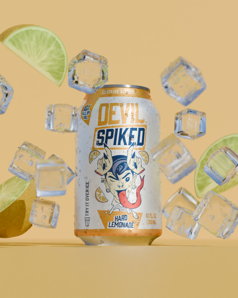
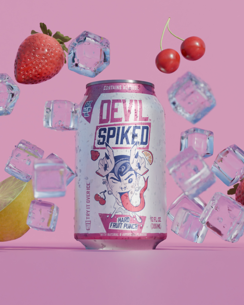
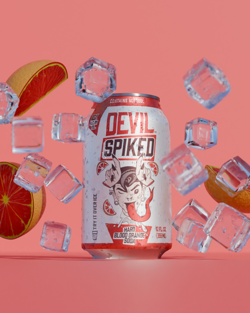
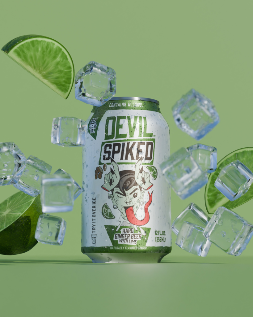
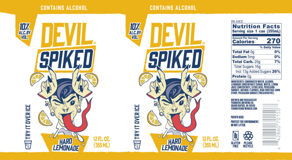
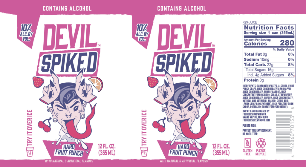
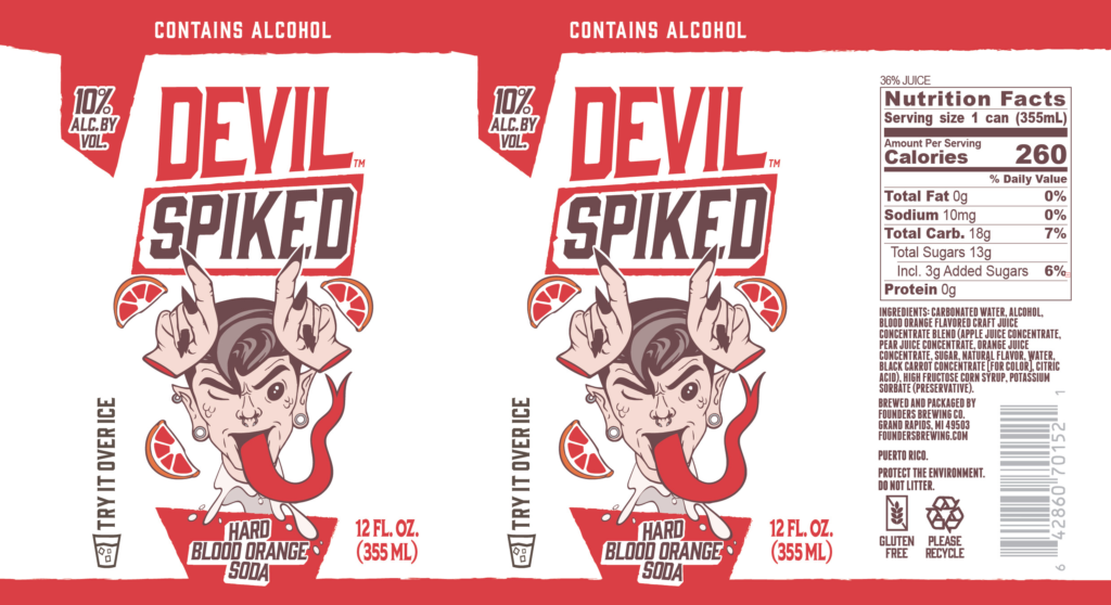
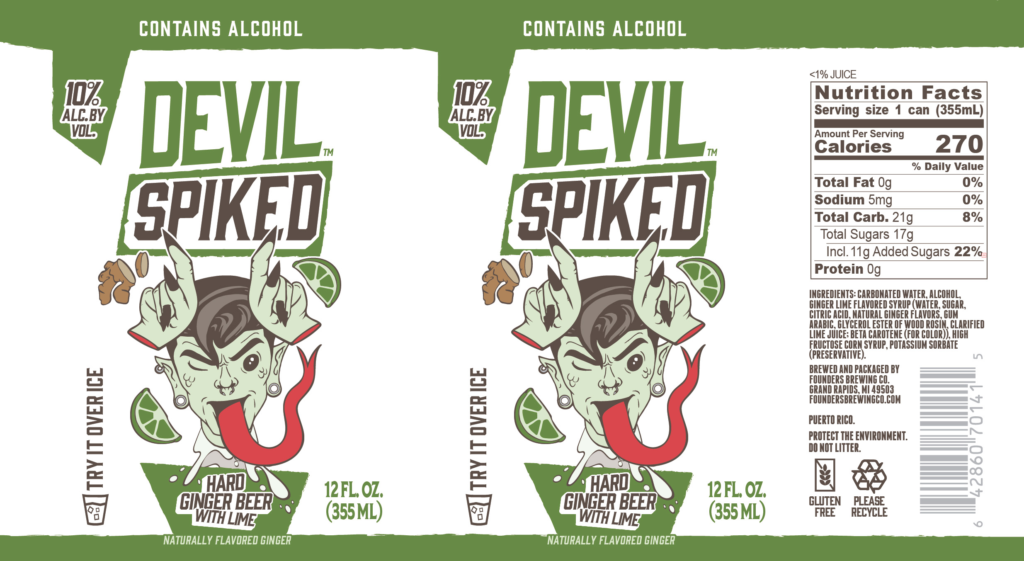
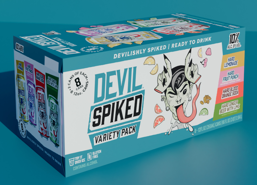
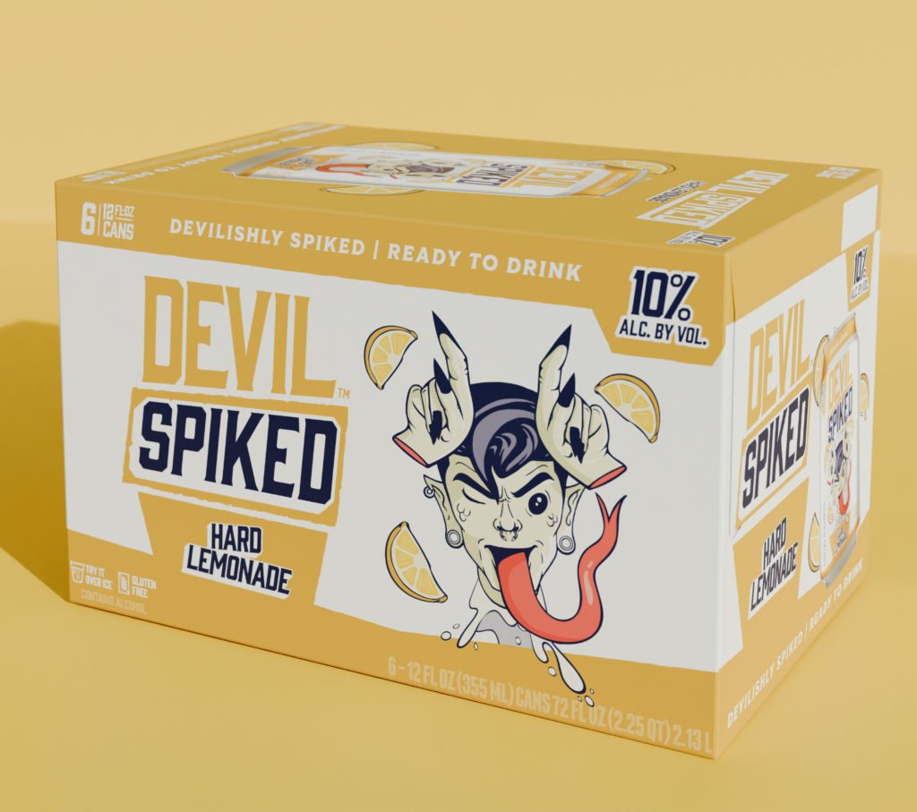
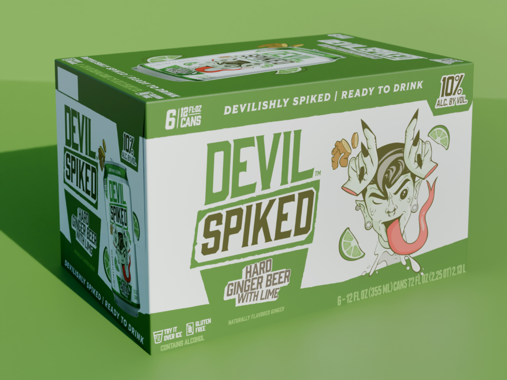
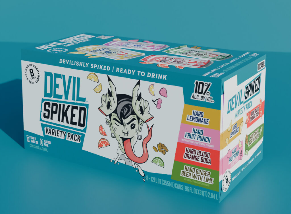
Devil Spiked is Founders Brewing Co.’s first ready-to-drink (RTD) product line—designed to deliver maximum flavor and value at 10% ABV in a casual, social format.
The challenge was to introduce a bold RTD brand that could resonate with Gen Z and younger Millennials while remaining approachable in the Midwest’s more conservative retail environment.
The Challenge
RTDs often lean ultra-minimal or overly polished, underselling strength and personality. Devil Spiked needed to clearly communicate:
- High ABV and value (“bang for your buck”)
- Fun, energetic drinkability
- Approachability, despite a provocative name
With Founders headquartered in the Midwest Bible Belt, the brand needed to lean playful rather than aggressive—balancing the word Devil with illustration and tone that felt lighthearted, not confrontational.
Audience Insight
The target audience is Gen Z and young Millennials looking for:
- Convenient, high-impact drinks
- Clear value (10% ABV)
- Brands that feel irreverent, not intimidating
The design needed to feel party-ready and accessible, not dark or edgy—inviting consumers to crack a can without overthinking it.
Design Strategy
The system was built around contrast and intent:
- A bold brand name softened through playful, expressive illustration
- High-energy, flavor-driven color palettes for fast SKU recognition
- Clear communication of alcohol content without intimidation
The Can System
Single-serve cans are never presented individually on shelf, allowing illustration to take visual priority over flavor naming. As a result:
- Illustration intentionally leads the hierarchy to create shelf impact
- Flavor is secondary but reinforced through color and visual cues
- ABV remains clearly visible to signal value
Subtle visual imbalance was used throughout the system to create a sense of motion and instability—suggesting the fast-onset “tipsy” effect of a 10% ABV drink without being literal. Each flavor stands out while remaining unmistakably part of the Devil Spiked family.
The Carrier System
Carriers serve as the primary on-shelf communication, and hierarchy shifts accordingly:
- Flavor and pack configuration become more prominent
- Illustration acts as a hero image, embedding flavor cues at a larger scale
- Bold color and character ensure visibility from a distance
The illustration system translates cleanly from cans to carriers, maintaining consistency while adapting to format-specific needs.
Hierarchy & Readability
Carrier hierarchy was optimized for fast retail scanning:
- Brand name (Devil Spiked)
- Flavor
- ABV callout
- Supporting illustration and secondary messaging
Production & Format Considerations
- Standard 12 oz aluminum cans
- Designed for high-contrast print performance
- Color systems chosen to remain distinct across flavors while minimizing production complexity
Launch Campaign
“The packaging system was extended into launch campaign materials, maintaining the same illustration language, color energy, and playful tone to support retail and social rollout.”
Outcome
Devil Spiked establishes a confident entry point for Founders into the RTD space—proving that high-ABV beverages can feel fun, social, and accessible without sacrificing clarity or shelf impact. The system balances personality with retail logic, allowing the brand to scale across flavors and formats while staying instantly recognizable in a crowded category.
