Founders Brewing Co.
Packaging Design Across Flagship, Seasonal, and Story-Driven Releases
A collection of packaging projects spanning system design, narrative concepts, and regional brand stewardship within an established craft beer brand.
Founders Variety Pack
Winter Variety Pack System
The Challenge
- Maintain individual beer identities
- Create cohesion across four SKUs
- Feel seasonal without becoming overly thematic
System Strategy
A consistent system was established across all four cans, built on three shared principles:
- A unified label shape to anchor the system
- Distinct color and pattern combinations to differentiate styles
- Illustration cues to reinforce flavor profiles and seasonal character
This approach allows consumers to recognize the beers as part of the same family while still easily distinguishing between styles.
Outcome
This project demonstrates how thoughtful system design can unify multiple products without sacrificing individuality. By relying on structure, hierarchy, and restraint, the variety pack feels cohesive, seasonal, and easy to navigate—both on shelf and in hand.
10k IPA
Story-Driven Craft Beer Packaging
10K IPA was born from a real bet inside Founders Brewing Co.
The brewery’s owners challenged the head brewer: if he could create an IPA that outperformed the brand’s best-selling beer, they’d pay him $10,000. The beer didn’t quite win the bet—but it was too good not to release.
The packaging was designed to turn that backstory into the brand itself.
The Concept
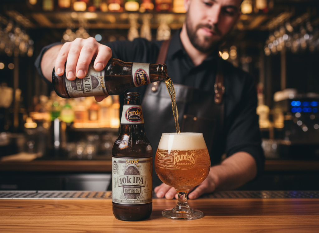
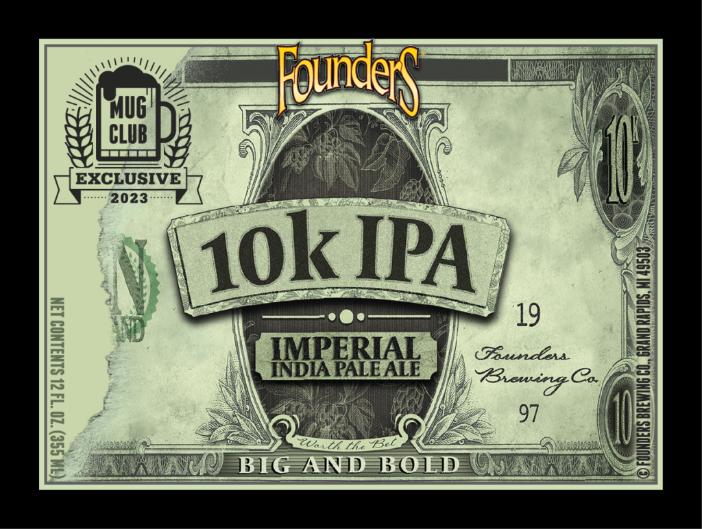
The idea was to treat the beer like a piece of currency—a playful nod to the wager that inspired it.
Since printing real money is highly illegal (and conveniently, there’s no such thing as a $10,000 bill), the label was designed as the first-ever $10K bill you could actually buy—for about six dollars.
The result is a label that feels familiar, collectible, and immediately intriguing on shelf.
Hidden Details & Easter Eggs
To deepen the narrative, subtle details were embedded throughout the design:
- “Founders Brewing Co.” signatures integrated into the layout
- 1997, the year the brewery was founded
- “Big and Bold,” pulled directly from the beer’s tasting notes
These elements reward closer inspection and reinforce authenticity without distracting from shelf readability.
Outcome
10K IPA demonstrates how brand storytelling can drive packaging design without overwhelming it. By anchoring the visuals in a familiar system—currency—the label delivers humor, credibility, and memorability while staying true to Founders’ craft beer heritage.
MI P1LSNER
Regional Packaging design
Regional flagship packaging designed to prioritize clarity, recognition, and retail performance.
The Concept
- Inspired by Michigan’s iconic license plate system
- Bold color blocking and utilitarian typography for instant legibility
- Familiar civic design cues reinterpreted through a modern beer lens
- Visual clarity that mirrors the pilsner’s clean, no-frills character
Outcome
The resulting packaging is confident, highly readable, and shelf-forward. Bright yellows and deep blues nod to Michigan’s visual language while giving MI P1LSNER strong presence in a crowded beer set. The system feels familiar yet contemporary—positioning the brand as an everyday pilsner with regional pride and modern appeal.
