Nuphoria cm
Neuropathy Supplement & Topical Packaging Refresh
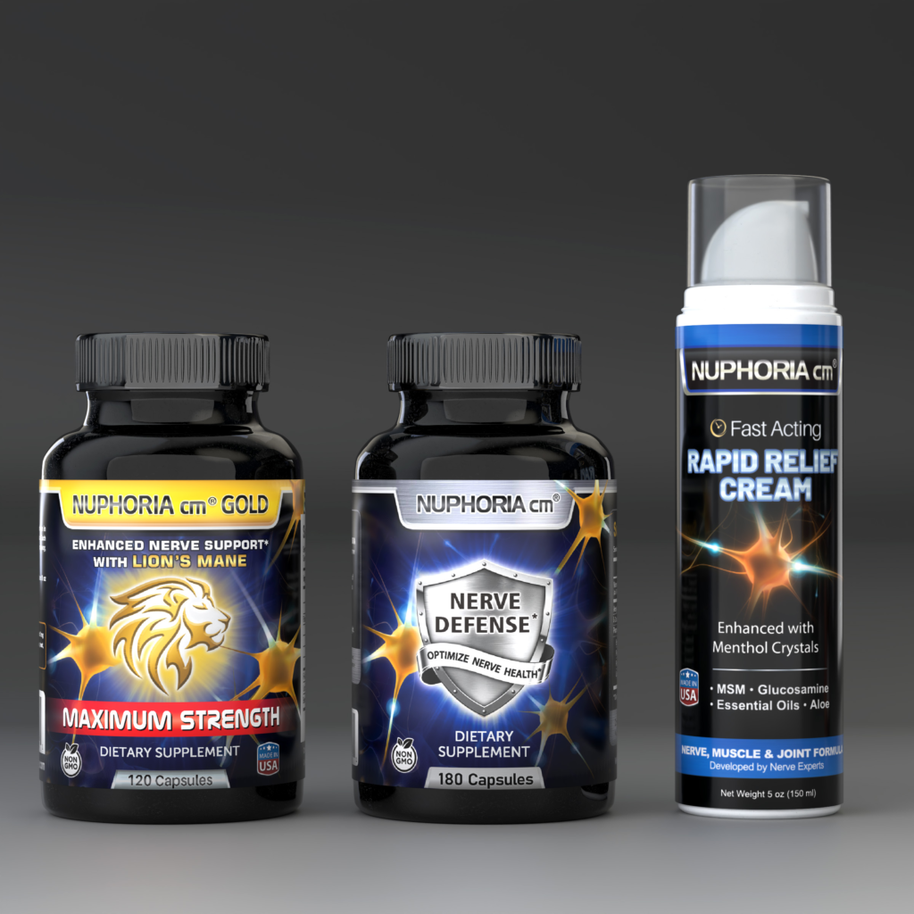
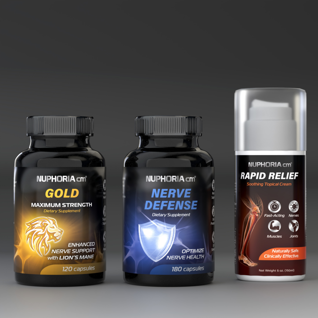
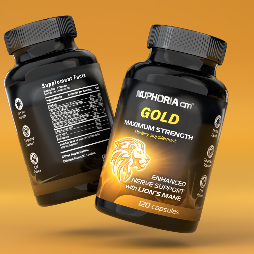
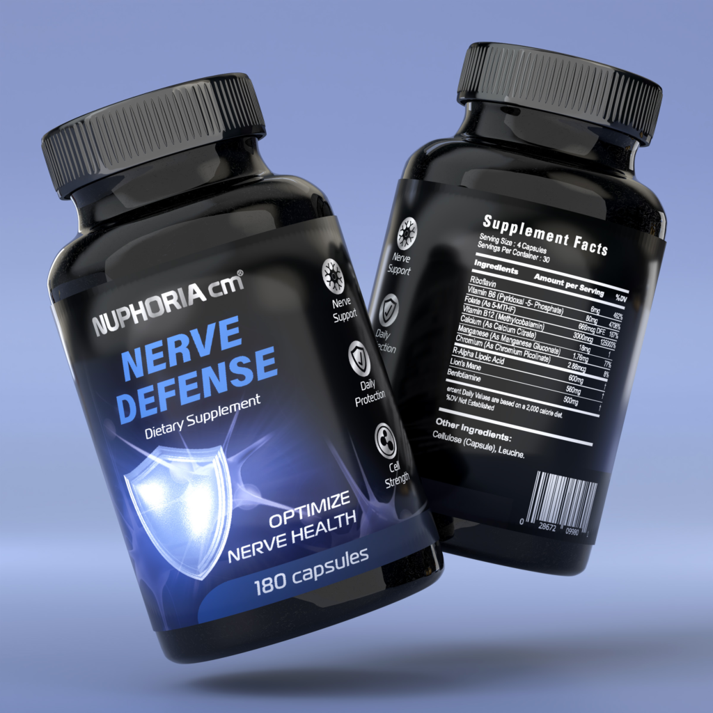
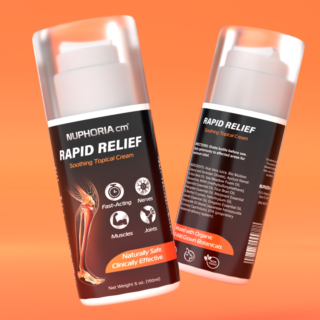
Nuphoria CM is a supplement and topical brand focused on supporting adults aged 40–60 managing neuropathy and chronic nerve discomfort.
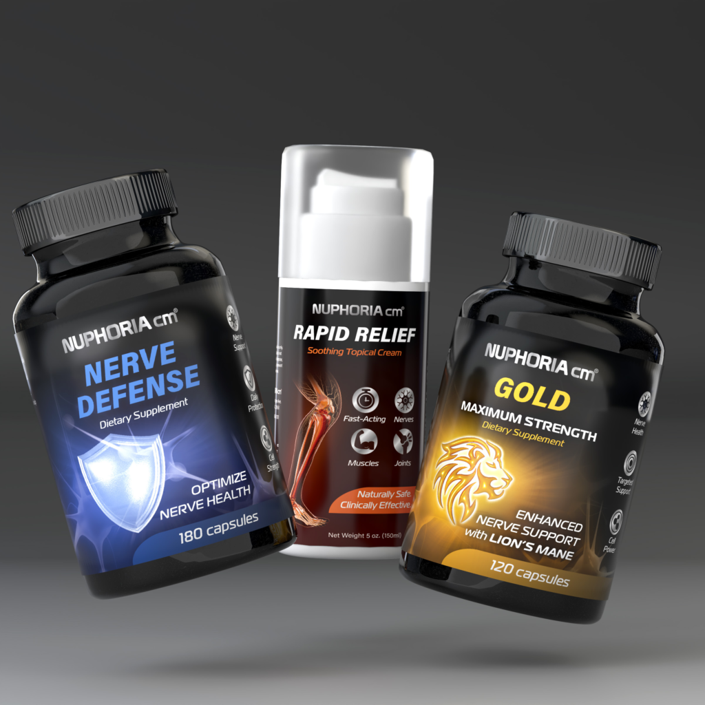
This project was a brand refresh, not a rebrand, aimed at improving readability, hierarchy, and shelf scanning while preserving the energetic visual language the brand’s owners were unwilling to abandon.
The Challenge
The existing packaging relied heavily on high-saturation color, aggressive contrast, and dense information layouts. While attention-grabbing, these choices worked against the brand’s core audience—older consumers who need clarity, legibility, and confidence when making health-related purchasing decisions.
The challenge was to tone down without stripping away—improving usability and trust while maintaining the brand’s recognizable, high-energy identity.
Before & After Approach
The original packaging relied on bright gradients, effects, and competing focal points—making it difficult to quickly understand what the product is, who it’s for, and how SKUs differ.
The refreshed system introduces clearer product naming, simplified iconography, disciplined spacing, and stronger contrast hierarchy, and refined color pallets. All changes were intentionally incremental, allowing the brand to evolve without alienating existing customers.
Audience Insight
The primary audience consists of adults aged 40–60 managing neuropathy. This group spends less time decoding packaging, prioritizes clear benefits, and requires strong legibility at shelf distance.
Design decisions needed to respect visual accessibility without making the brand feel outdated or clinical.
Outcome
This refresh demonstrates how thoughtful design can improve clarity and usability under strict brand constraints. By refining—not replacing—the existing visual language, the updated packaging better serves its audience while remaining immediately recognizable to existing customers.
