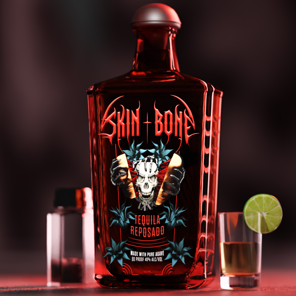
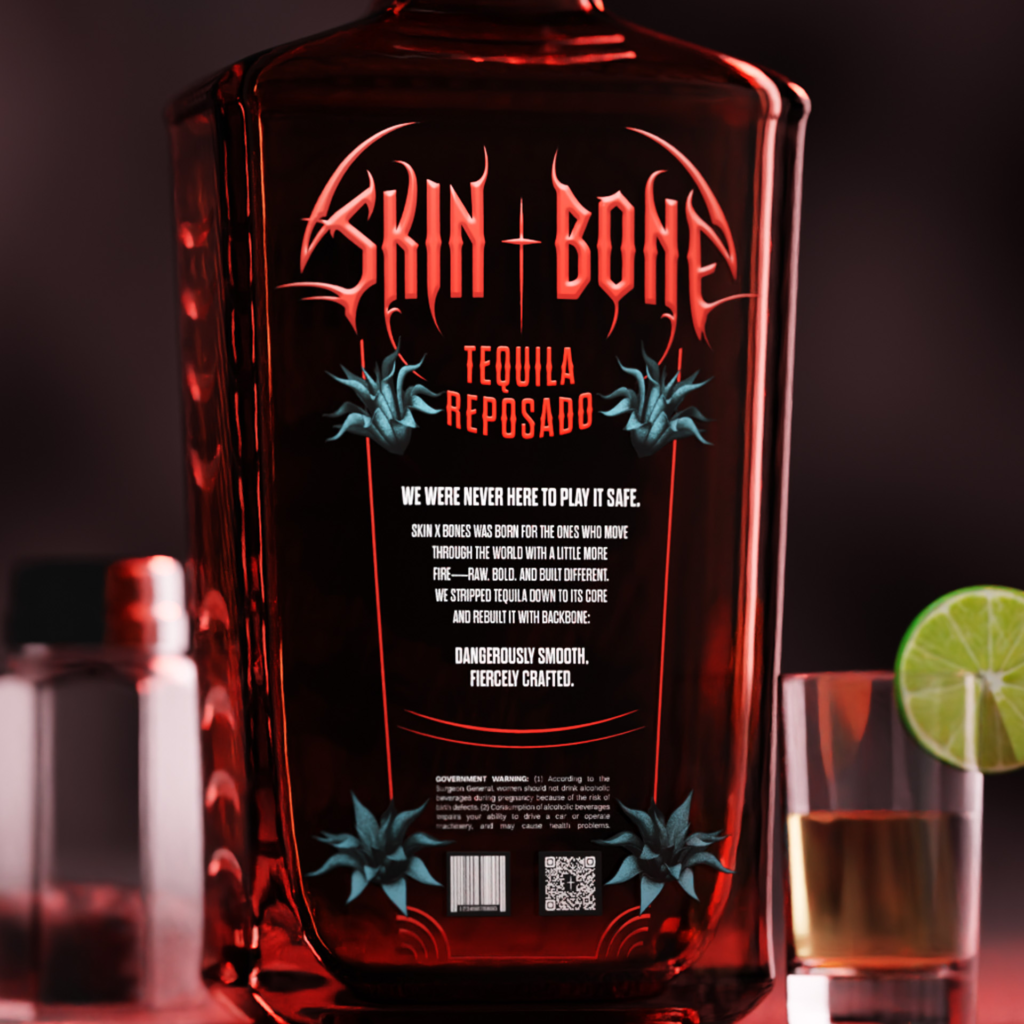
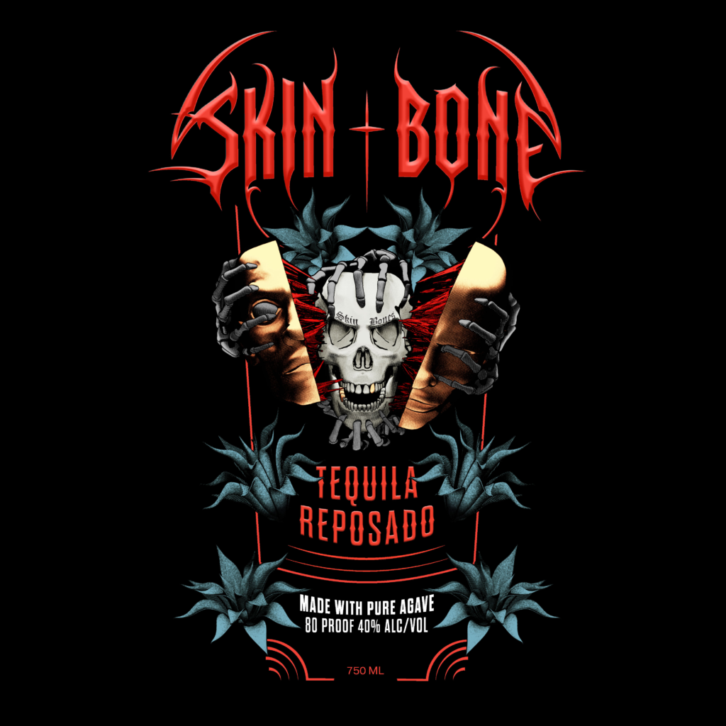
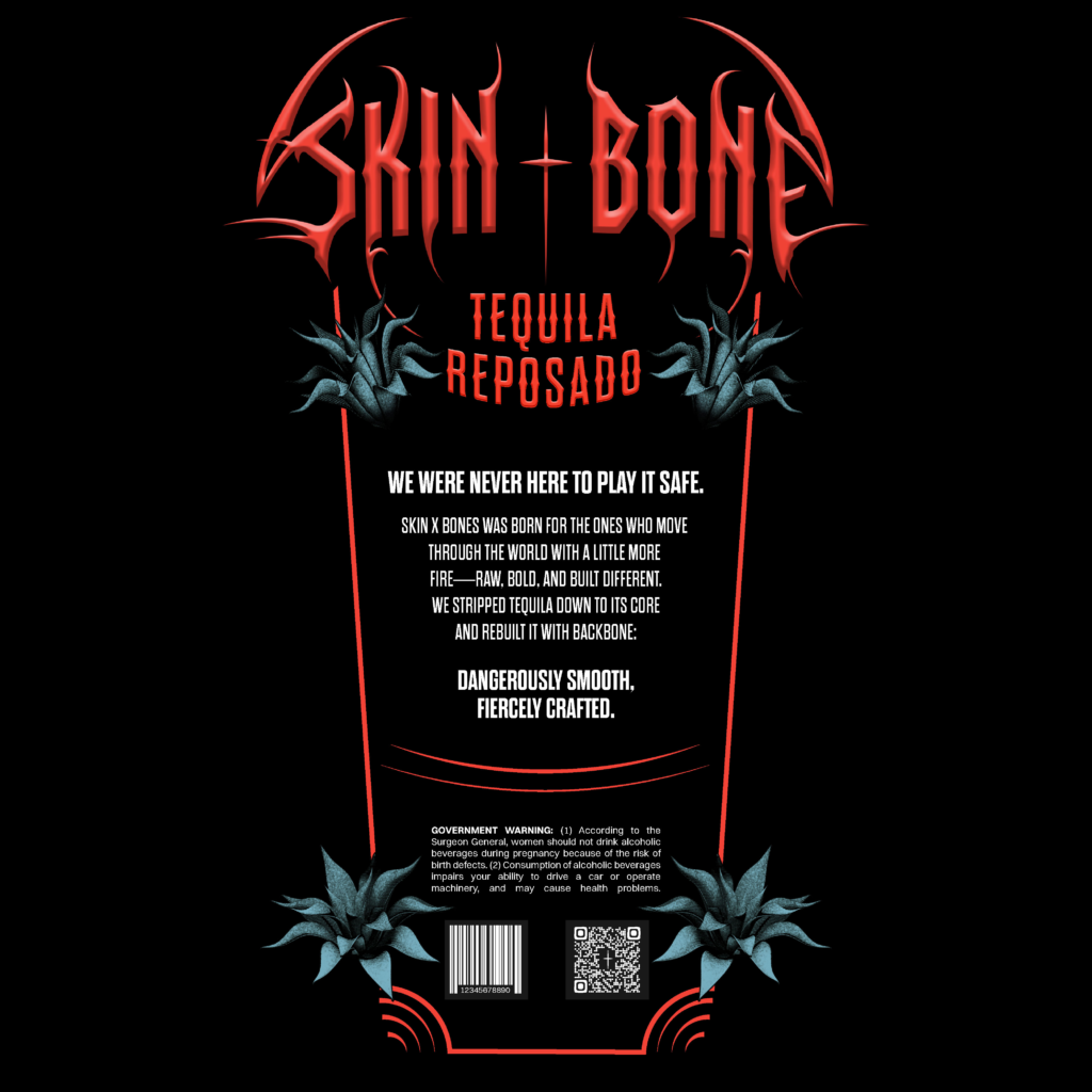
SKIN + BONE Tequila
Skin + Bone is a tequila brand designed for Gen Z and Millennial drinkers. The packaging challenges traditional tequila luxury by replacing ornate, heritage-driven cues with raw, modern, top-shelf design.
The Challenge
The premium tequila shelf is dominated by heritage-driven brands rooted in tradition and refinement. Skin + Bone was designed to disrupt that landscape—appealing to younger, nightlife-oriented consumers with a bold, emotionally charged identity that balances rawness with top-shelf credibility.
Skin + Bone needed to:
- Stand out in a crowded tequila set
- Appeal to a rebellious, nightlife-driven audience
- Balance grunge and rawness with top-shelf restraint
- Scale across multiple expressions without losing identity
Audience Insight
Gen Z and younger Millennials favor brands that feel honest, imperfect, and self-aware. Rather than polished luxury, they respond to texture, attitude, and storytelling that feels lived-in rather than manufactured.
Design Strategy
The design system was built around:
- Raw illustration and aggressive typography
- Minimal color palettes to maintain premium restraint
- Bold hierarchy prioritizing recognition at a distance
- Gritty visual language that suggests authenticity
The Sysetem
Skin + Bone was designed as a scalable system across expressions, allowing each variant to communicate a distinct personality while maintaining strong brand recognition.
Reposado
Warm tones and deeper contrast communicate richness, smoothness, and late-night energy.
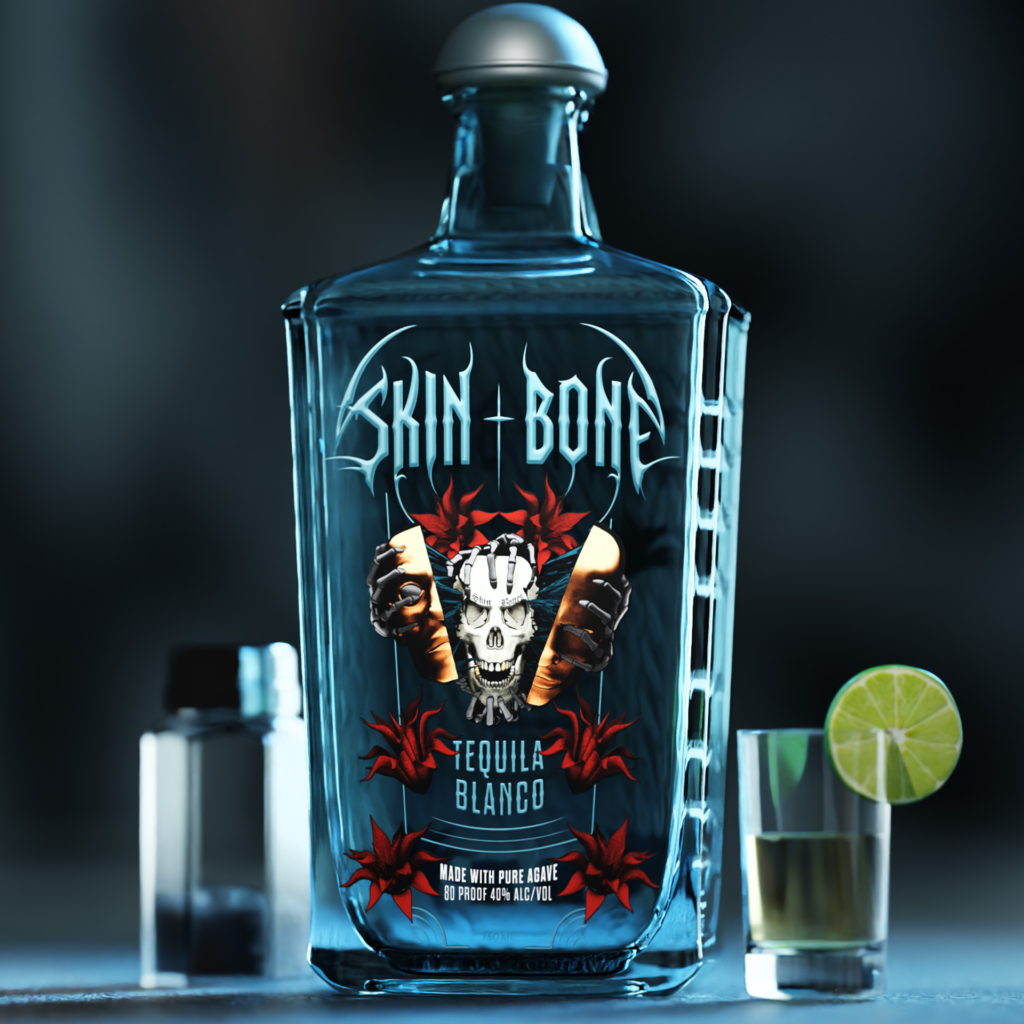
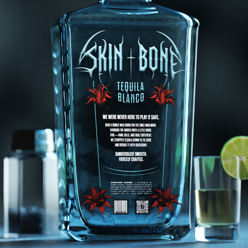
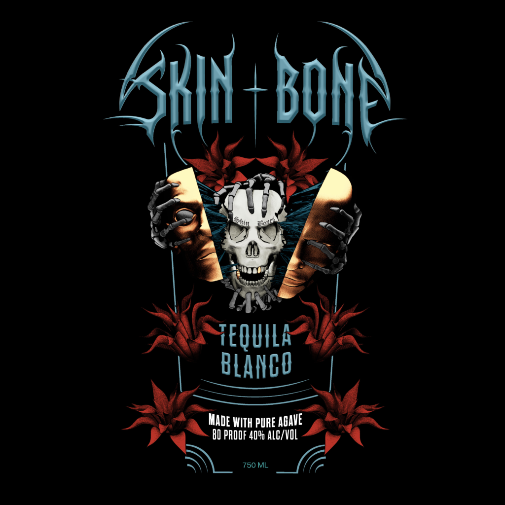
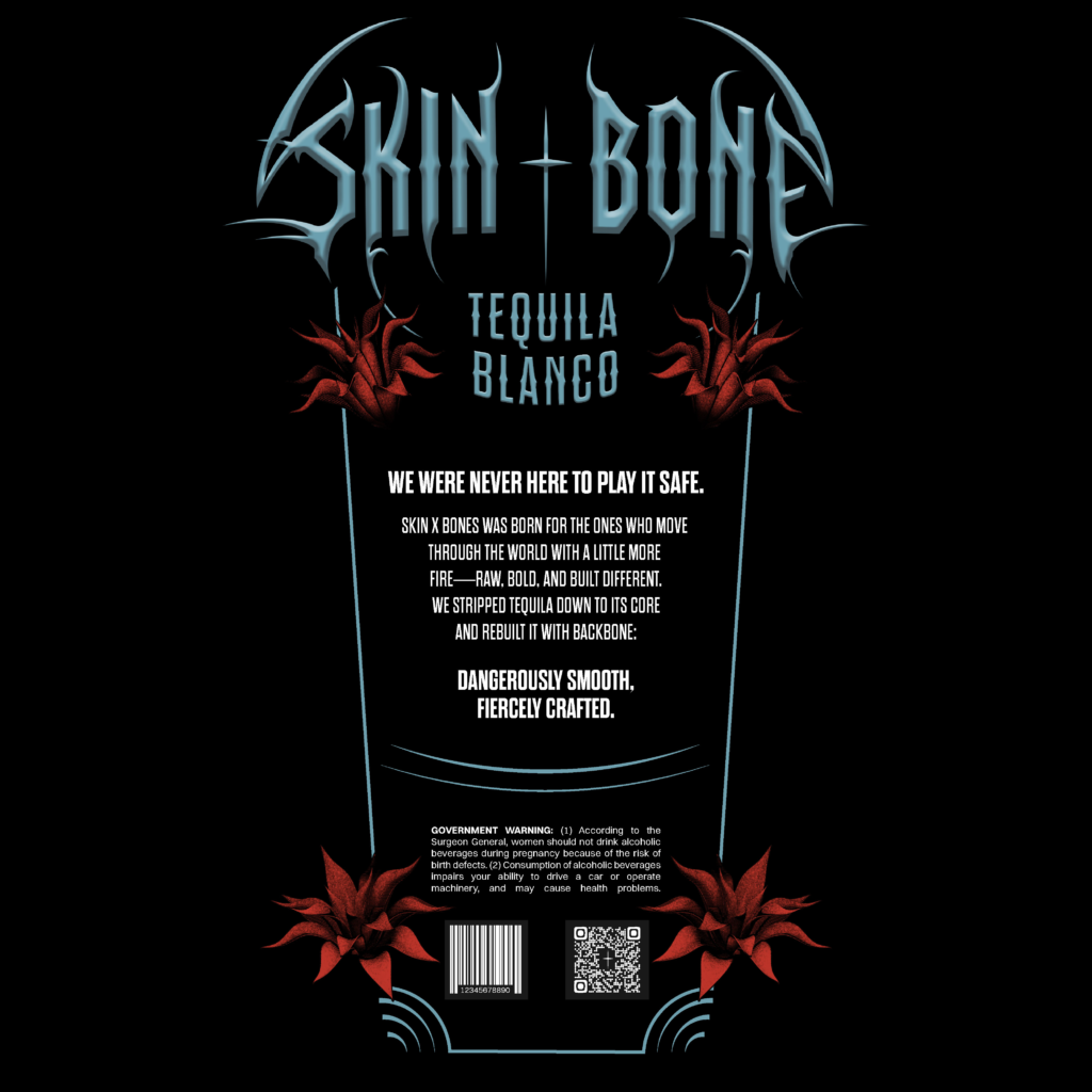
Blanco
Cooler hues and sharper contrast convey freshness, intensity, and immediacy—mirroring the blanco's un-aged profile.
Color and tonal shifts differentiate each SKU while illustration style, typography, and layout remain consistent to reinforce shelf presence and brand equity.
Hierarchy & Readability
Label hierarchy was designed for fast scanning in retail environments:
- Brand name
- Category (Tequila)
- Expression (Blanco / Reposado)
- Supporting storytelling and legal information
Typography and contrast were carefully balanced to ensure legibility at 3–6 feet while preserving the brand’s confrontational tone.
Materials & Production Intent
- Matte label stock to emphasize tactility and reduce glare
- Restrained ink palette to maintain premium positioning
- Designed with real-world print and production constraints in mind
Outcome
Skin + Bone demonstrates how premium spirits branding can evolve beyond heritage-driven aesthetics to connect with younger consumers—proving that rebellion, restraint, and system thinking can coexist on the top shelf.
